1 Product director
2 Engineers
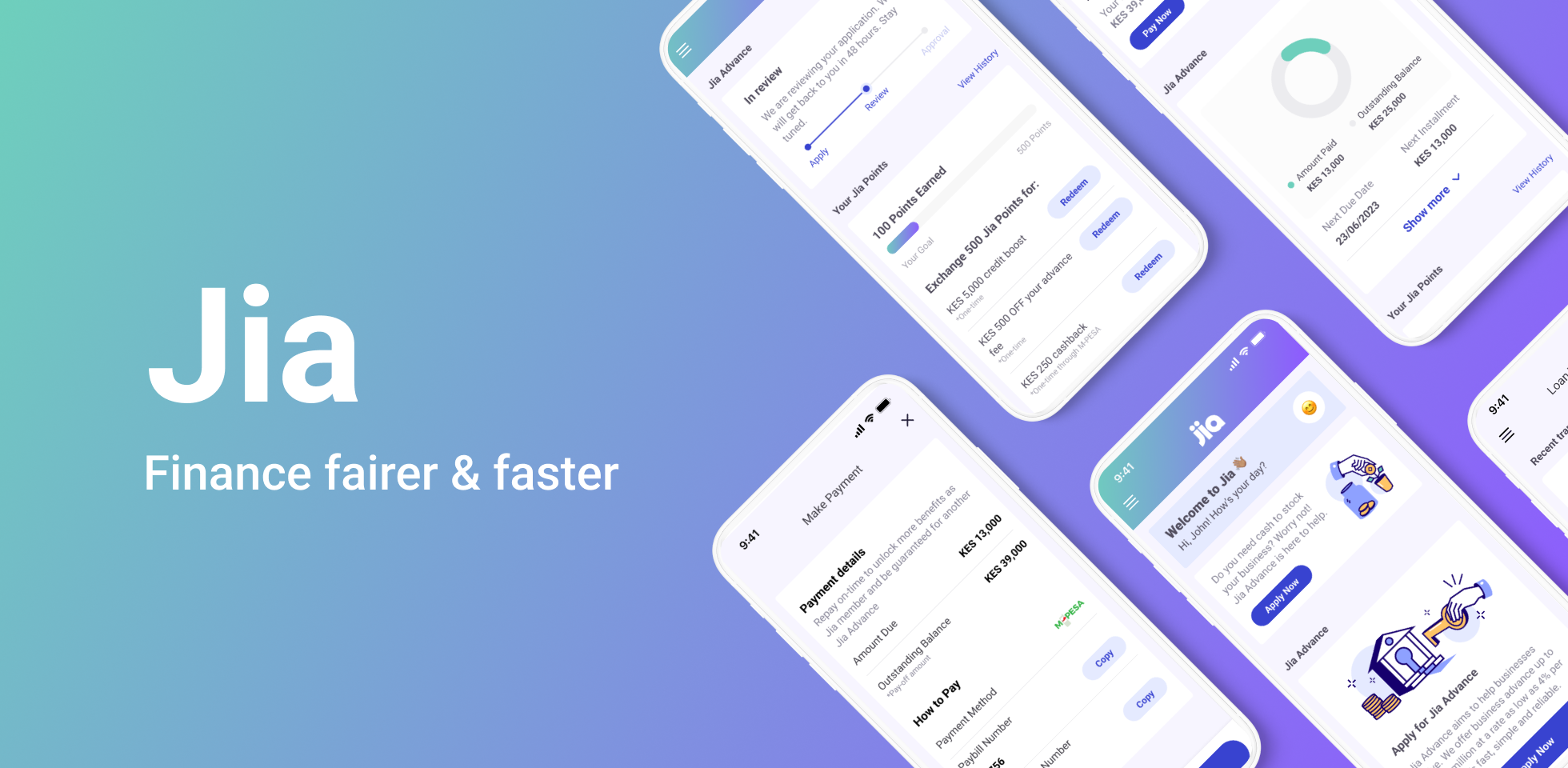
Landing page
Flyer design
Creating a better digitalized loan application experience for small business owners in Kenya and Philippine.
Overview
Jia is a fintech company that leverages blockchain technology to offer financing solutions to small businesses in Kenya and the Philippines. As they prepared to launch their first product, we undertook the task of redesigning the app. The initial design was reworked to enhance simplicity and efficiency, with a primary focus on improving performance and scalability. The main objective of this redesign was to create an app that is easy to use and understand, specifically tailored to meet the needs of key users in the target markets
My impact
As the Lead Designer for this project, my role involves working closely with stakeholders synthesize user requirements, prioritizing tasks, and defining the visual style of the product.
I focused on ensuring that the app not only meets current needs but is also well-equipped to adapt to future changes and user demands, and ensuring consistency and scalability. Once launched, this app is set to streamline Jia's processes and accelerate its new user acquisition
The context
Advancing App Design with New Funding Before Initial Launch
Jia is a small but growing fintech company with fewer than 20 employees, spread across the US, Europe, the Philippines, and Kenya. For about a year, they have been providing financing solutions manually and in-person to business owners. While we are preparing the launch of this pioneer product, the company recently secured a significant $4.3 million in seed funding. Jia set out to refine the design of the digital product that they are trying to design, especially to better align with regional user preferences in key markets.
So, they approached us to undertake a redesign of the app, aiming to make it more engaging and user-friendly, while maintaining its essential features.
The Goal
Redesign the App to Align with Key Markets' User Needs While Maintaining Essential Features.
Understanding the users
Small business owners in Kenya and the Philippines
The primary users of Jia's fintech app are small business owners in the Philippines and Kenya. These users typically fall within the age range of 35 to 45 years old, often balancing their entrepreneurial endeavors with family responsibilities. Their businesses are not just sources of income but are integral to their family's livelihood. A common need among them is accessing funds to purchase more inventory, indicating a reliance on consistent cash flow for business growth and stability.
One notable characteristic of this user group is their varying levels of comfort with technology. While they are accustomed to some basic digital tools for business operations, their familiarity with more advanced technology, particularly concepts like blockchain and cryptocurrencies, is limited.
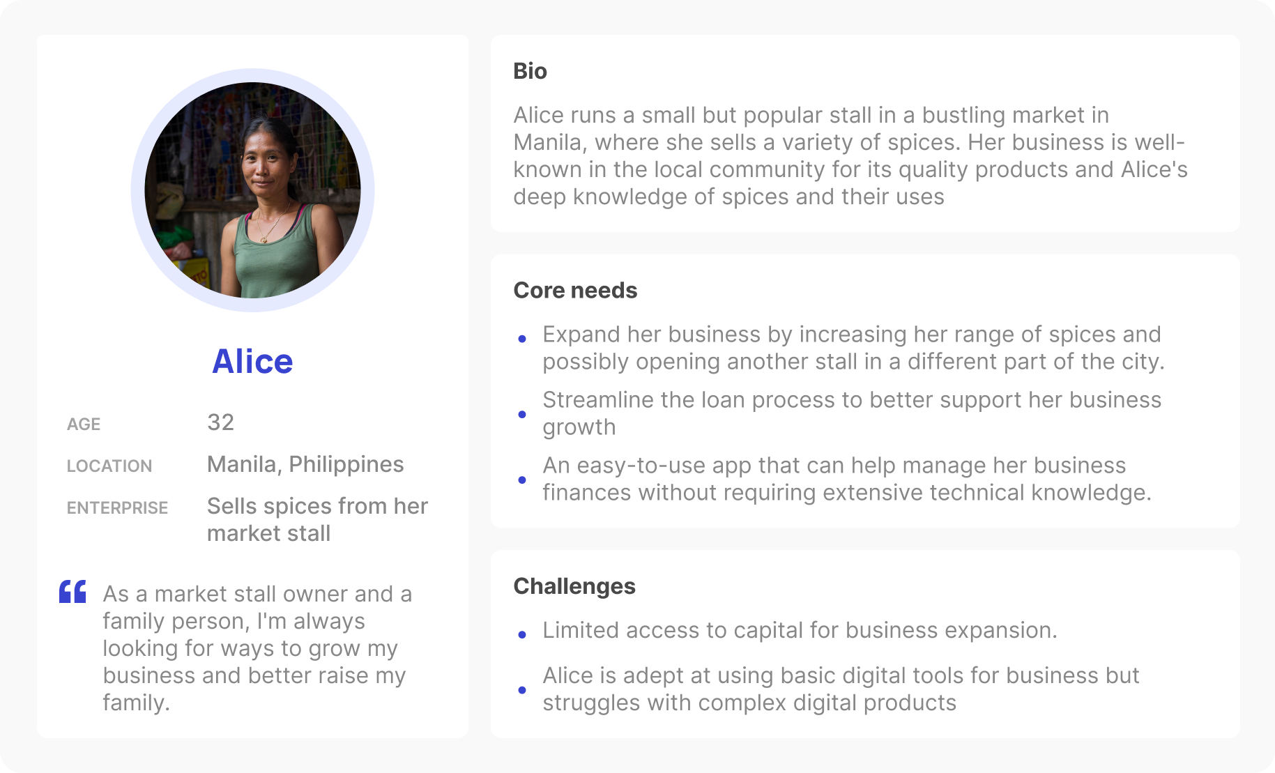
Meet Alice, looking for simple financial solutions to better provide for her family
Key insights
Simplicity and Clarity:
Given the varying levels of comfort with technology among users like Alice, we should avoid overwhelming users with too many features or complex terminology.
Intuitive Navigation and Layout:
Having an intuitive layout with easily recognizable icons and a logical flow, such as a well-organized menu, clear call-to-action buttons, and a straightforward process.
Localization and cultural relevance:
Adopting a visual style that resonates culturally with users in Kenya and the Philippines, enhancing usability, engagement, and fostering user connection.
Current market solutions
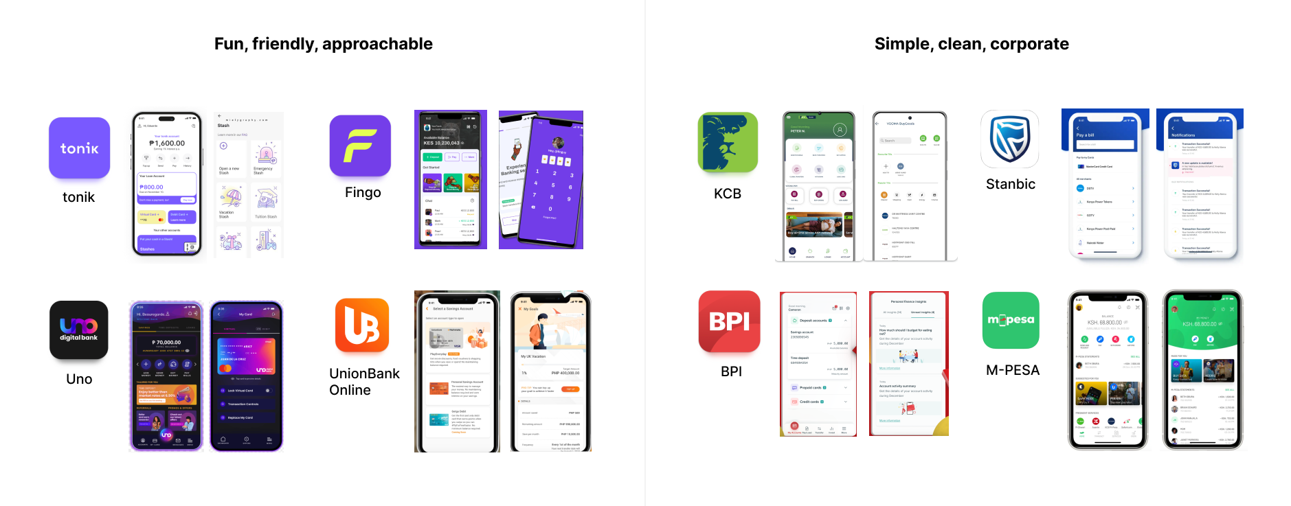
Simple, fun, and friendly
After analyzing popular fintech apps in Kenya and the Philippines, we noticed a trend towards simple yet colorful and illustrative designs, with some appearing corporate and others more playful. After talking with our product director about how we want our app to feel for users like Alice, we decided on a friendly and fun design. This choice reflects our goal to make financial management approachable and engaging for small business owners, setting Jia apart from more corporate-looking apps.
The Problems
Problem #1:Unclear CTAs
The top section of the homepage, a vital area for user engagement where users can repay loans or receive notifications, suffered from unclear calls to action (CTAs) amidst a large volume of text. When users need to repay a loan, they click on the CTA and are taken directly to another app for payment, causing confusion and a disjointed user experience. This design created difficulties for user understanding and interaction, potentially affecting the overall user experience and the efficiency of completing key financial tasks by breaking the seamless flow of the app and increasing the risk of transaction abandonment.
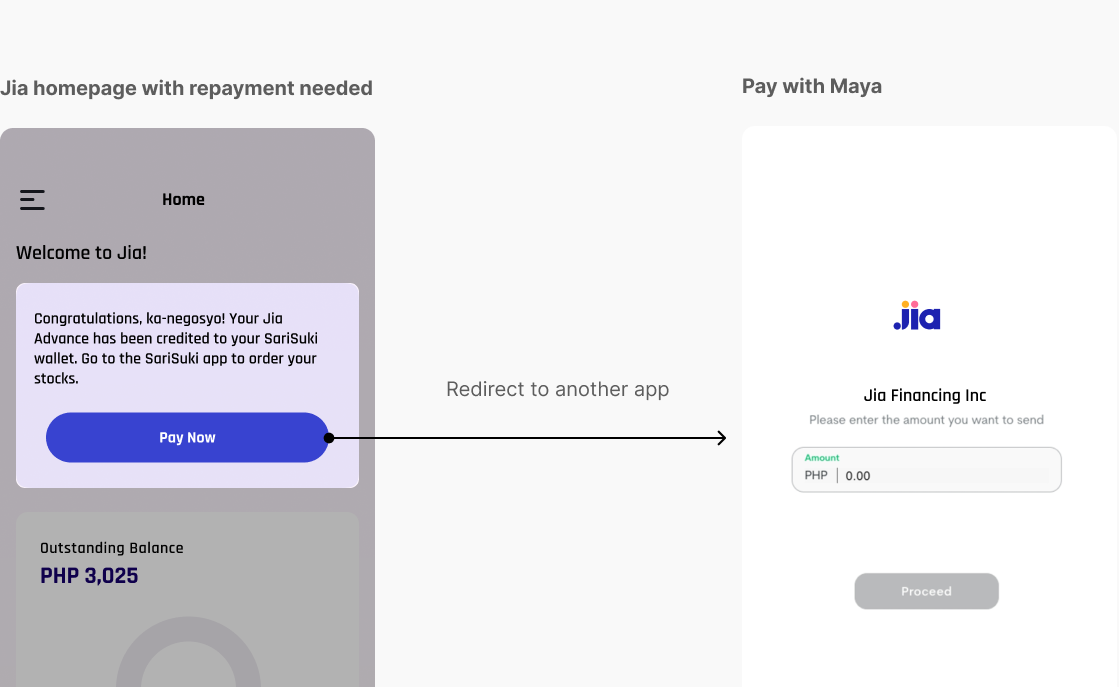
When users click on the CTA button for repayment, it immediately redirects them to another app for repayment.
The solution
Improving Clarity with Visual Elements

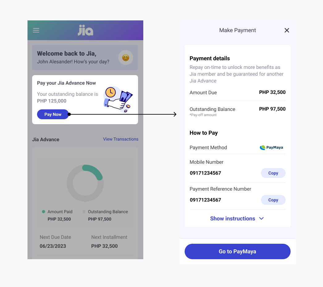
To improve the user experience, I introduced visual elements tailored to each card's purpose. A progress bar now visually indicates tasks in progress, fostering a sense of ongoing activity. For repayments, custom illustrations provide clarity, while a red button for overdue payments adds a sense of urgency. Additionally, a 'claim offer' card was added, enabling users to confirm loan receipt directly, thereby increasing user control and interaction. These enhancements aim to make navigation more intuitive and tasks more manageable for users.
Adding a confirmation page after each action
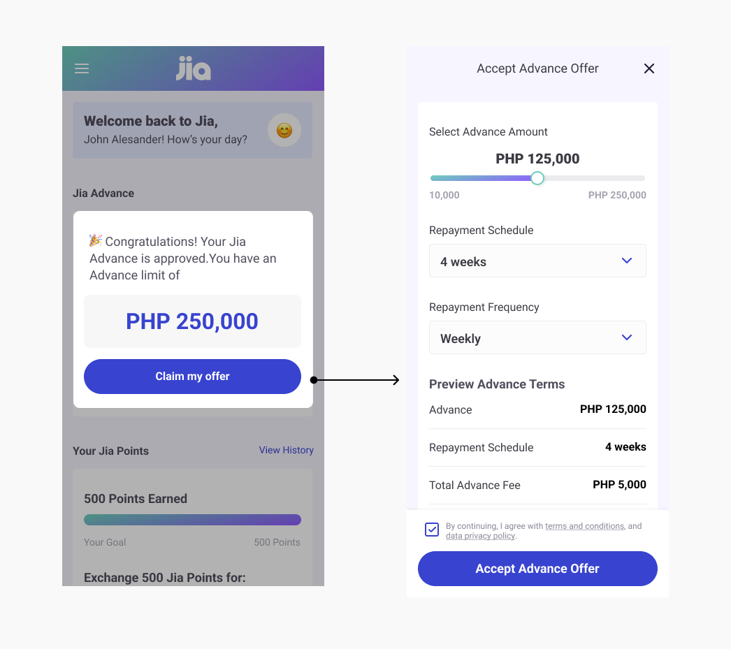
Confirming a loan offer
Enhanced User Control: It gives users the opportunity to review and confirm their decision before committing to a loan, providing a sense of control over their financial choices.
User Trust: By allowing users to confirm their loan decisions, the app demonstrates a commitment to user-centric design, which can build trust and loyalty.
Confirming a repayment information
Increased User Confidence: Provides users with a detailed repayment information and easy-to-follow instructions builds trust with users.
Reduces Anxiety: Clear information and instructions can alleviate this anxiety by providing a predictable and understandable path to fulfilling their financial commitments.
The Problem
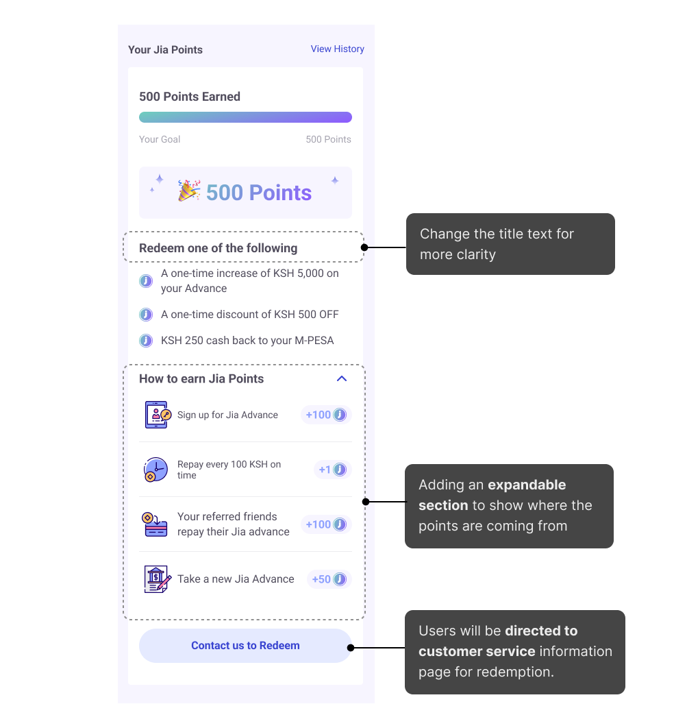
Problem #2: Unclear Reward Redemption Interface
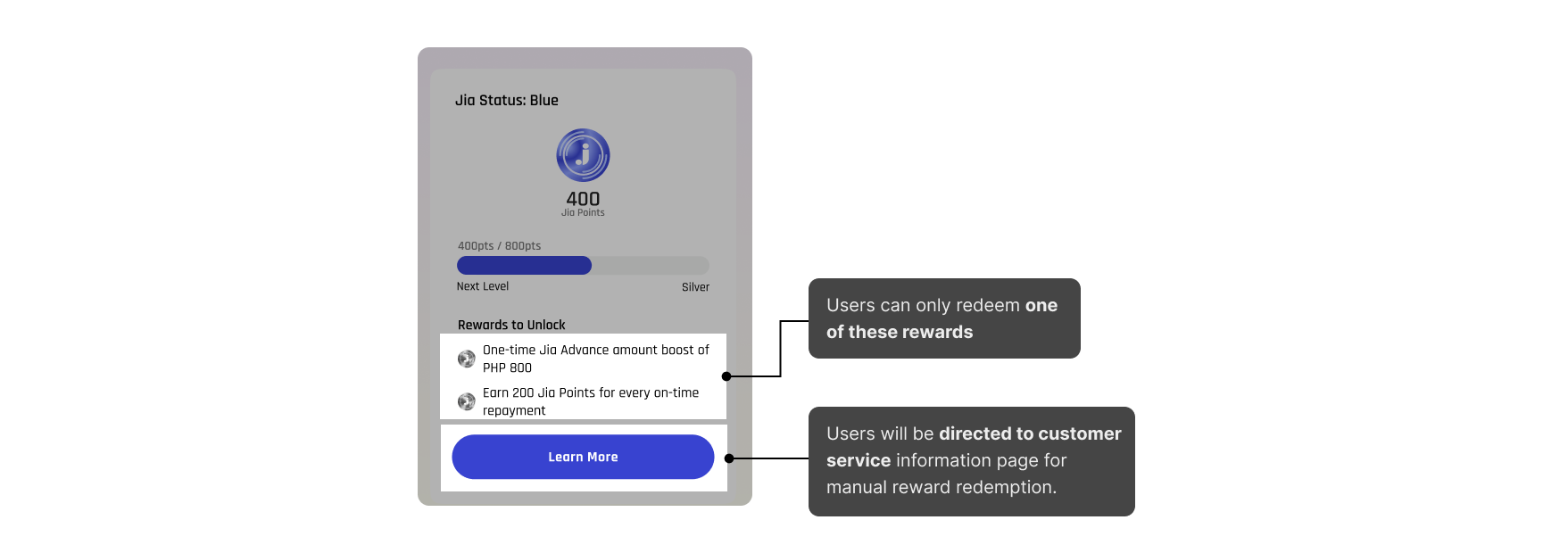
The app presents a list of rewards from which users can only redeem one, but it lacks clear indications or guidelines on this limitation. Additionally, the "Learn More" button, intended to guide users to a page for manual reward redemption via customer service, does not convey its purpose. This lack of clarity can lead to user confusion, frustration, and a diminished experience, as users might struggle to find how to redeem their rewards.
The iterations
1st Iteration
Text Modification: Changing the title text to "Redeem One of the Following", immediately clarifying that only one reward can be selected for redemption. Replacing the "Learn More" button with "Contact Us to Redeem" eliminates ambiguity about how to proceed with redeeming a reward.
Introduction of a "How to Earn Points" Section: Adding a section that explains how points can be earned not only provides transparency about the rewards process but also motivates users by showing them various ways to accumulate points. This addition helps in making the rewards system more engaging and understandable.
2nd Iteration
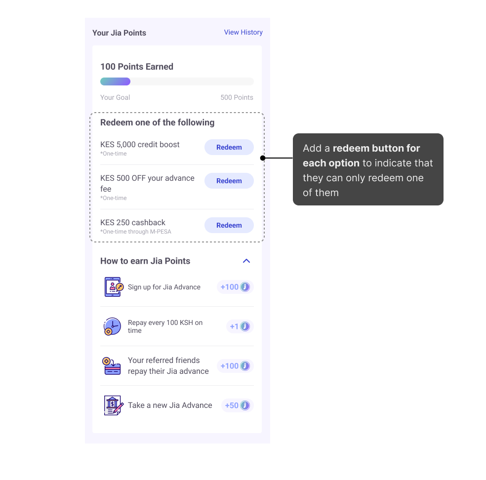
Simplification of Reward Descriptions: Making all the options more concise and easier for users to understand at a glance. This simplification helps users quickly grasp the value of each reward, facilitating a smoother decision-making process.
Relocation of the Redeem Button: Placing the "Redeem" button directly after each list item ensures that the action step is immediately accessible right where the decision is made. This layout change minimizes navigation effort and streamlines the redemption process, likely increasing the likelihood of users taking action.
The solution
Final design (improved based on 2nd iterations)

In our final design, we introduced a pop-up that activates upon tapping the 'Redeem' button. This pop-up features a clear call-to-action — "Contact Us to Redeem" — along with the WhatsApp number for users to reach out to. Additionally, we incorporated an expandable 'How to Earn Points' section. This section lists straightforward actions along with the corresponding points each action is worth, providing users with a clear understanding of how they can accumulate points. This design choice aims to streamline the redemption process while keeping users informed and engaged.
The Problems
Problem #3: Limited growth opportunities
Originally, our plan was just to help current customers who already had loans or applied for them in person. But I suggested we should also make it easy for new customers to apply for loans online. This way, we're not just helping our current customers but open up opportunities for new customers.
The Approach
Thinking Ahead for Growth: Making Room for New Customers
After talking with the product director, we decided to think ahead about the company's future. We aligned goals to first make sure everything works great for our current customers. Then, if we have enough time, we'll work on the online application for new customers
The solution
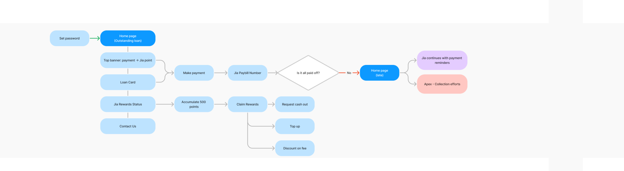
A streamlined application flow that complements the main user journey, ensuring it can be seamlessly integrated without disrupting existing operations.

The top section of the homepage, a critical area for user engagement where users can accept loans, repay them, or receive notifications, suffered from unclear calls to action (CTAs) amidst a large volume of text. This design flaw hindered user understanding and interaction, potentially affecting the overall user experience and the efficiency of completing key financial tasks.
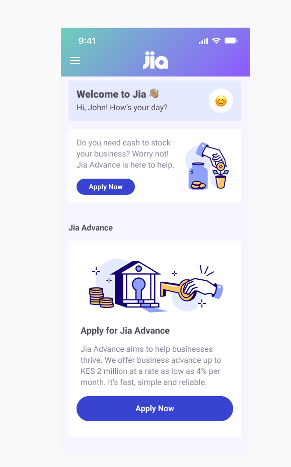
A Clear Entry Point with Direct Call to Action
I ensured consistency with the existing CTA button style used on the homepage. This approach maintains visual harmony and brand identity across the platform.
The button's text "Apply Now" immediately communicates the action that users are expected to take. It's straightforward and leaves no room for ambiguity, helping users understand that they can start the application process with a single click.

Use form elements to enhance user interaction and data accuracy.
In the form's design, I carefully selected a variety of form elements to enhance user interaction and data accuracy. Dropdown menus are used for selecting predefined options, reducing user errors. Radio buttons offer clear choices for mutually exclusive options, ensuring straightforward decision-making. Date pickers are integrated to facilitate easy entry of dates, enhancing user convenience and preventing format inconsistencies.
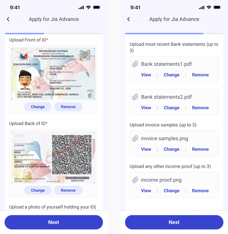
Efficient File Management
For efficient management of uploaded documents, the image files display thumbnails for quick identification, with single images showing a larger preview. All files are listed clearly, showing names and types, and offer easy options to view or replace them, streamlining the user's file management experience.
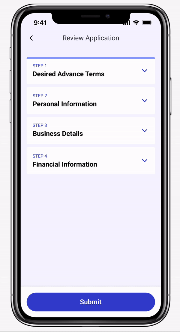
Submission Review: Enhancing User Control
At the end of the application process, I integrated a review section for users to verify their information before submission. Each part of the application can be expanded or collapsed for ease of review, with an 'Edit' option available for quick adjustments.
Final Designs
Key frames ------

Looking ahead
Measuring Success and Planning for the Growth
User Engagement Metrics: We'll closely monitor user engagement levels, particularly focusing on metrics like daily active users, session length, and frequency of transactions. Understanding these patterns will help us identify features that are resonating with users and those that need refinement.
Feedback Analysis: User feedback, both qualitative (through surveys and interviews) and quantitative (app ratings, feedback forms), will be crucial. We'll look for trends in this data to understand user satisfaction and pain points, particularly regarding our new features such as the clearer CTAs, the reward system, and the application flow.
Conversion Rates: For the new application flow, we'll track conversion rates to see how many users start the application process versus how many complete it. This will help identify any drop-off points and inform necessary adjustments to the flow.
Usability Testing: Post-launch, we'll conduct ongoing usability tests to continually refine the user interface, especially the localized elements tailored for our target markets in Kenya and the Philippines.